Cryptocurrency exchange for retail investors
Colda is a cryptocurrency exchange for retail investors who trade, hold, and spend digital assets from one account. It unifies portfolio tracking, real-time market data, asset swaps, and a branded debit card inside a dark interface calibrated for confident decision-making under volatility.
- Client
- Colda
- Service
- Web Application
- Start date
- Nov 2025
- End date
- Apr 2026
- Duration
- 5 months
- Headquarters
- Zug, Suiza
- Team size
- 11-50 employees
- Industry
- Finance
The challenge
Retail crypto investors in 2025 still juggle three or four disconnected tools to manage a single portfolio. One app for trading, another for analytics, a third for card-based spending, and a spreadsheet to reconcile them all. Every context switch erodes confidence, and confidence is the scarcest resource in a volatile market.
Colda entered this environment with a clear thesis: a mid-market exchange could win not by offering more assets or lower fees, but by removing the friction between seeing, deciding, and acting. The brief called for a web application that collapsed trading, portfolio tracking, performance analytics, and card management into one cohesive surface — without overwhelming a user who might check positions three times a day or thirty.
The constraint that shaped every downstream decision was density. Crypto dashboards trend toward information overload. The challenge was to display portfolio value, allocation, P&L, recent activity, and market movement simultaneously while keeping cognitive load low enough for a retail user, not a professional desk trader.
Discovery and research
Competitive audits of twelve existing exchanges and portfolio trackers surfaced a consistent pattern: platforms designed for institutions were leaking downmarket, carrying their complexity with them. Retail users inherited order books, depth charts, and margin controls they never touched but could never fully ignore.
User interviews with active self-directed investors revealed that the decision cycle — check portfolio, assess market, execute trade — rarely takes more than ninety seconds. Yet most platforms forced that cycle through three or four separate screens. The critical insight was temporal: design had to respect the compressed attention window of a retail investor checking positions between meetings, not the extended session of a full-time trader.
Behavioral observation also exposed the emotional weight of color. In crypto interfaces, red and green carry outsize psychological impact. How and when those signals appear — alongside which numbers — directly influences whether a user feels informed or anxious.
Competitive landscape
The retail crypto exchange category splits into two camps. Legacy platforms like Coinbase and Kraken built trust through regulatory compliance and breadth of assets but accumulated interface debt across a decade of feature additions. Newer entrants like Robinhood Crypto simplified aggressively, stripping out analytics and wallet controls to reduce friction at the cost of user agency.
Colda identified the gap between these extremes: an exchange that offered institutional-grade portfolio intelligence — allocation breakdowns, performance benchmarking against market indices, P&L per asset — inside an interface that never required more than two clicks to reach any action. The competitive advantage was not a feature list; it was information density paired with interaction simplicity.
The branded card integration also differentiated Colda from pure trading platforms. By connecting spending to holdings, the product addressed a real behavioral gap: users who accumulate crypto but rarely convert it into daily utility.
Design strategy
Three principles governed the visual and interaction system:
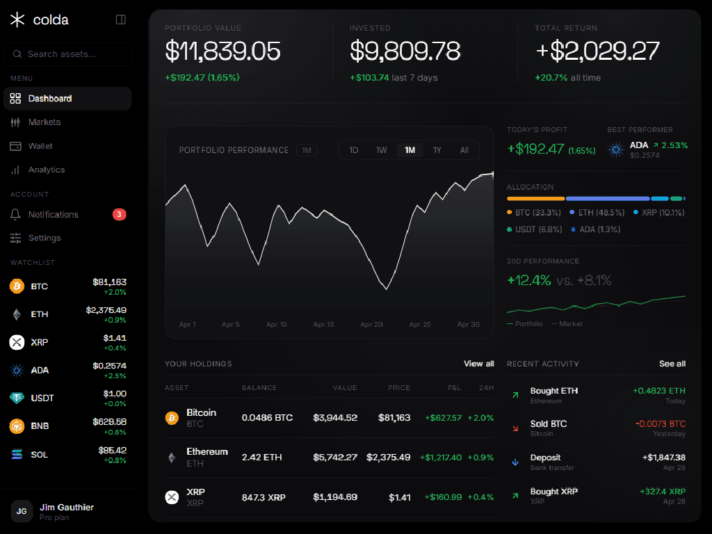
- Monochromatic restraint — the interface operates almost entirely in grayscale, reserving color exclusively for semantic signals: green for gains, red for losses, blue for informational states. This prevented the visual noise that plagues most financial dashboards.
- Typographic hierarchy over decoration — a geometric sans-serif for numerical values and a humanist typeface for body text created a natural reading layer without card borders or background color shifts. Numbers demand instant legibility; labels demand quiet context.
- Progressive density — the dashboard reveals portfolio value, daily change, and allocation at a glance. Deeper metrics — average cost basis, 30-day alpha, win rate — surface only when the user navigates to analytics or asset detail. This graduated disclosure kept the primary surface calm while rewarding deeper exploration.
Information architecture
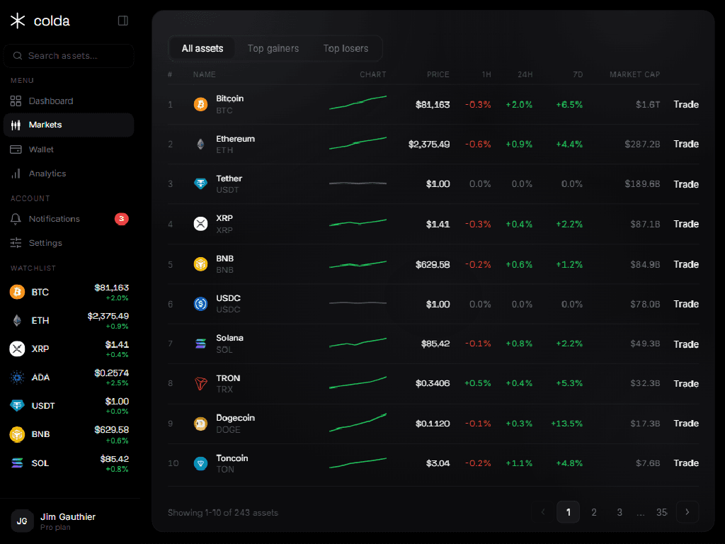
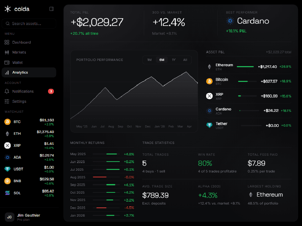
The navigation model reduced the entire application to four primary destinations: Dashboard, Markets, Wallet, and Analytics. A persistent sidebar on desktop provided both navigation and a live watchlist, ensuring price movement remained visible regardless of which view was active.
The mental model rewarded a natural decision sequence. Each view served a distinct cognitive need without duplicating data:
- Dashboard — how is my portfolio doing right now?
- Markets — what else should I consider?
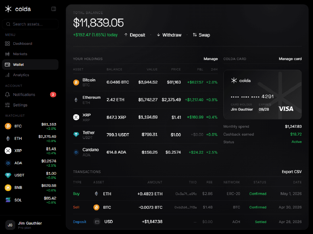
- Wallet — what do I own and what can I do with it?
- Analytics — how have my decisions performed over time?
Asset detail functioned as a contextual overlay accessible from any table row — markets, holdings, or watchlist. This avoided the fragmentation of dedicated asset pages while preserving the depth a user needs before executing a trade.
Core experience
The dashboard consolidated the three metrics that matter most at a glance — portfolio value, invested capital, and total return — into a hero row with real-time change indicators. Below that, a performance chart with selectable time ranges sat alongside quick stats: today's profit, best performer, allocation bar, and a 30-day performance comparison against the broader market.
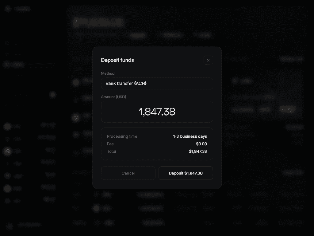
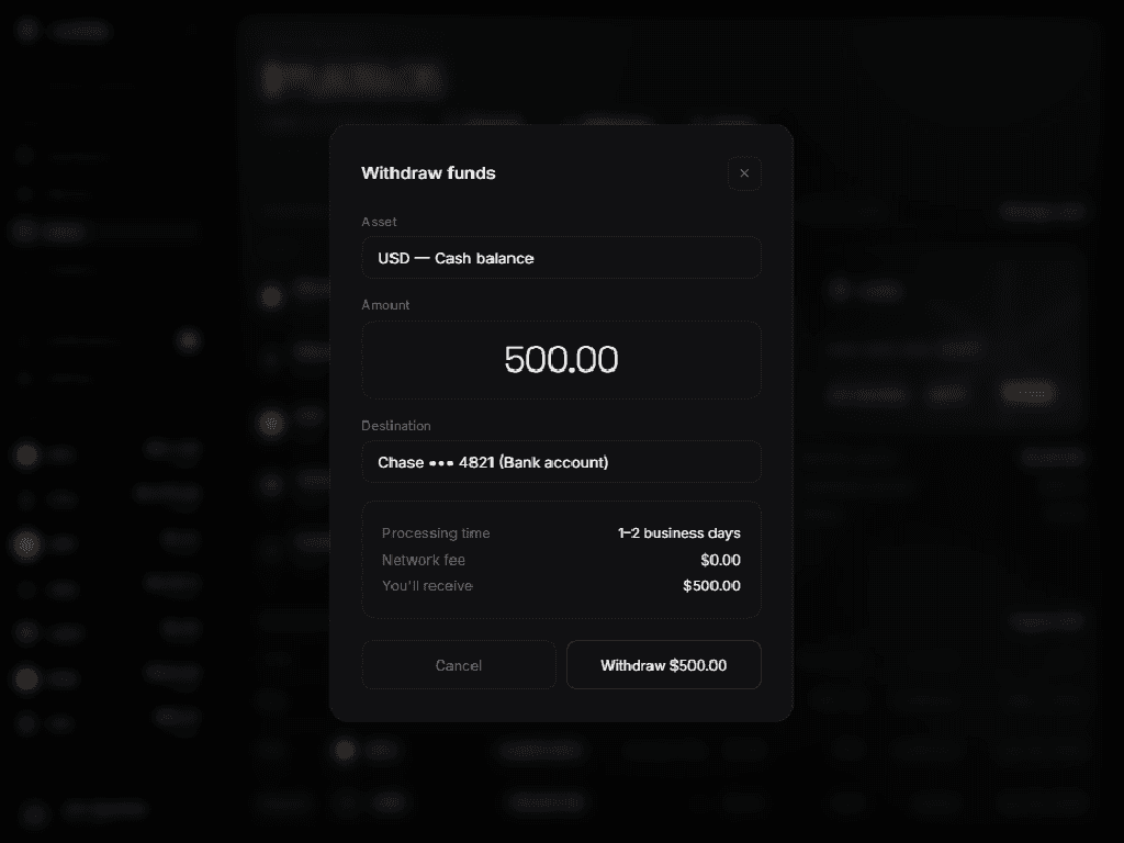
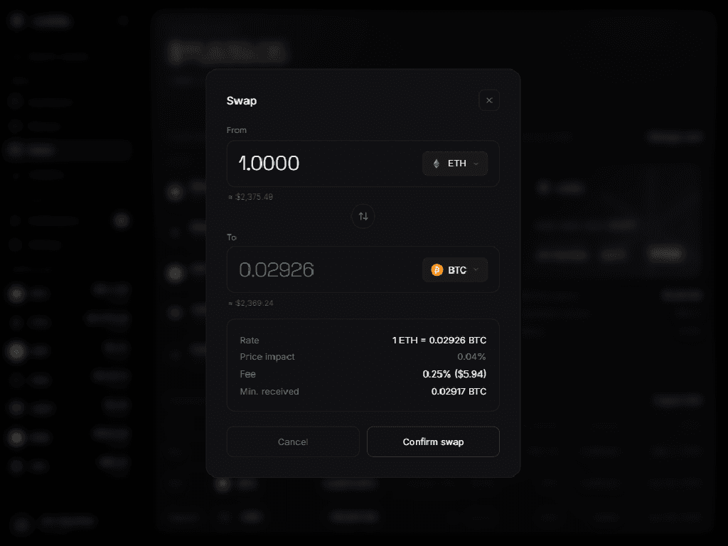
Trading operated through lightweight dialogs rather than dedicated pages. Buy, sell, swap, deposit, and withdraw each opened a focused modal with pre-populated values, a live preview of the transaction outcome, and a single confirmation step. This pattern reduced the average path from intent to execution to two interactions: open dialog, confirm.
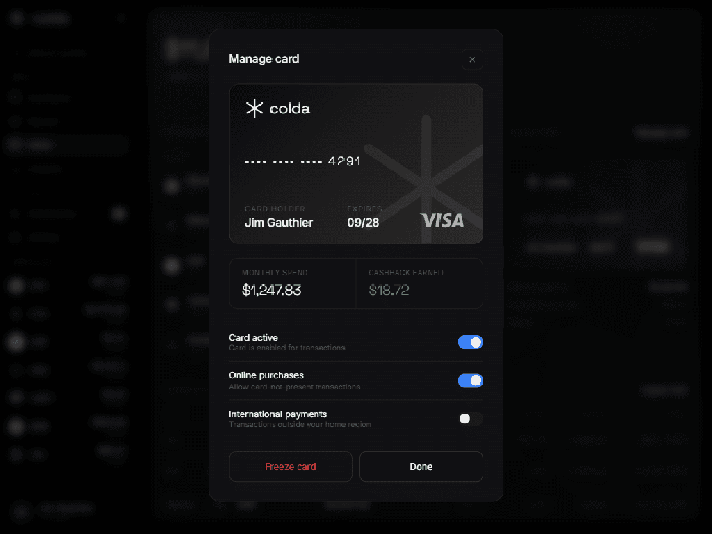
The Colda Card section inside the wallet view bridged holding and spending. Users could see monthly spend, cashback earned, and card status alongside their asset holdings, reinforcing the connection between crypto as an investment and crypto as a spending instrument.
Expectations vs. delivery
The original brief described a trading interface with basic portfolio tracking. The delivered product expanded that scope in three substantive ways:
- Analytics module — monthly return breakdowns, per-asset P&L bars, trade statistics, and alpha calculation gave users a level of performance introspection typically reserved for wealth management platforms.
- Card management — the system evolved from a simple display into a full control surface with toggle-based security settings for online purchases and international payments, transaction-level fee visibility, and a freeze function. This transformed the card from a marketing feature into a genuine product surface.
- Responsive adaptation — the mobile experience went beyond layout redistribution, introducing a purpose-built bottom navigation, a compact header, and intelligent column pruning across every data table. Less critical fields like average price and allocation hide on smaller screens while preserving the data that drives action.
Results and impact
The delivered platform compressed a multi-tool workflow into a single authenticated session. Users no longer needed to cross-reference a portfolio tracker with an exchange with a spreadsheet — the information hierarchy made it possible to assess, decide, and execute inside one continuous surface.
The analytics module proved to be the highest-engagement section after launch. Monthly return breakdowns and market-relative performance gave users a reason to return even when they had no intention to trade, increasing session frequency and deepening the relationship between the user and the platform.
Colda's product team reported that the card integration drove measurable increases in deposit activity, as users who connected spending to their portfolio became more engaged with funding their accounts. The design engagement established a reusable component system and interaction patterns that Colda continued to extend into subsequent features without requiring a redesign.