Training platform for high-performance athletes
Forge is a fitness operating system consolidating workout programming, nutrition tracking, body composition monitoring, and performance analytics into one dark-themed dashboard — designed for committed athletes who demand the same precision from their training tools that they bring to every session.
- Client
- Forge
- Service
- Web Application
- Start date
- Jan 2026
- End date
- Apr 2026
- Duration
- 3 months
- Headquarters
- Austin, United States
- Team size
- 1-10 employees
- Industry
- Technology
The challenge
Tracking fitness across five or six disconnected apps produces noise, not insight. Athletes bounce between a workout logger, a nutrition tracker, a body-weight graph, and scattered notes — rebuilding context every time they switch tools. Each app does one thing adequately; none connects the dots between volume, caloric expenditure, macronutrient timing, and body composition trends.
The brief called for a single fitness training dashboard that consolidated all training data without sacrificing analytical depth. The target audience already had discipline — they didn't need motivation mechanics or gamified streaks. They needed a command center that respected their commitment and surfaced meaningful patterns across training, nutrition, and recovery.
A secondary constraint was emotional register. Fitness platforms tend toward either sterile data tables or gamified reward loops. The product needed to feel serious and purposeful — an instrument for someone who already trains daily, not a toy designed to manufacture habits in someone who doesn't.
Discovery and research
Interviews with twenty athletes who logged more than four sessions per week revealed a consistent pattern: the more committed the user, the more fragmented their tooling. Advanced lifters maintained spreadsheets alongside two or three apps, cross-referencing data manually to find patterns their individual tools couldn't surface.
Competitive analysis confirmed that the fitness-tracking category optimizes for onboarding — bright colors, simple animations, congratulatory badges. Products built for serious athletes either felt utilitarian or borrowed visual language from clinical health monitors. Neither approach resonated with the target persona: someone who trains daily, eats with intention, and expects their tools to match that effort.
The reframing insight was that workout accuracy — how closely execution matches programming — was the underserved metric. No mainstream tracker measured adherence to prescribed sets, rep schemes, and rest intervals with meaningful granularity. This gap became the product's differentiating concept.
Competitive landscape
The fitness-tracking market splits into three tiers. Consumer apps prioritize accessibility and social virality — step counters, streak badges, friend challenges. Mid-tier platforms add periodization and nutrition logging but present them as separate modules with inconsistent interfaces. Professional coaching tools offer depth but lock functionality behind trainer-managed accounts, treating the athlete as a passive recipient of programming.
Forge identified the gap between consumer gamification and professional rigidity. The target user trains independently, makes their own programming decisions, and wants a single surface across all training dimensions — with analytics a coach would value, delivered in a self-service format without the coach's overhead or gatekeeping.
Differentiation rested on three pillars: consolidation without compromise, accuracy as a first-class metric, and a visual identity that signals competence rather than entertainment. The product would not compete on breadth of exercise libraries or social features; it would compete on the density and quality of the training intelligence it returned.
Design strategy
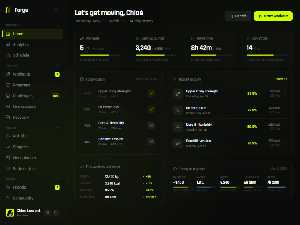
The visual system anchored itself on a dark canvas with a single high-energy accent — a luminous green reserved exclusively for active states, confirmations, and personal bests. Every other element recedes into muted neutral tones, establishing a strict hierarchy where only the most actionable data pulls attention.
Three design principles governed every interface decision:
- Progressive density — the home view shows summaries; deeper views reveal granular data on demand, rewarding exploration without overwhelming at first glance.
- Contextual comparison — every metric appears alongside its target or historical benchmark, eliminating navigation to find context.
- Kinetic typography — numerical values sized proportionally to their importance on each screen, creating scannable layouts.
The interaction language favors immediacy. Start a workout, log a meal, record a weight — these primary actions surface on every view through consistent accent-colored buttons. Secondary exploration lives in the sidebar structure and card-level links, never competing with the primary call to action.
Information architecture
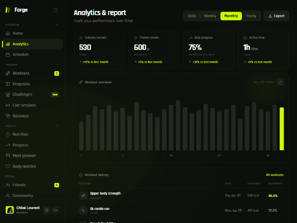
Navigation divides into four semantic groups — Overview, Training, Health, and Social — each collapsed into a sidebar section with distinct iconography. The grouping mirrors how athletes think about their practice: what happened today, what to train next, what to eat, and who to compete with. This conceptual mapping reduces cognitive overhead for users navigating between training and nutrition contexts.
The home view operates as an executive summary: four KPI cards at the top, today's scheduled plan on the left, recent activity on the right, and a weekly comparison anchoring the bottom. Every element is a doorway into a deeper view, but the home alone answers the question "how am I performing right now?" without requiring a single additional click.
Workout, nutrition, and progress views share a consistent card-based grammar — header with icon and title, body with primary content, optional action link — so users develop spatial memory quickly. Tables, charts, and logs follow the same density pattern: overview first, detail on demand, export always available.
Core experience
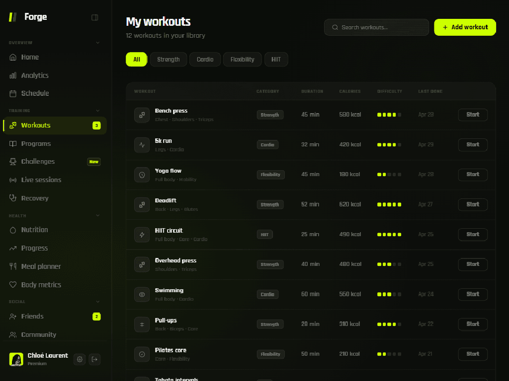
The workout flow moves from library to session to report. The library presents all exercises in a filterable table with category badges, difficulty ratings, and last-completed dates — everything needed to choose a session in seconds. Category filters along the top allow instant narrowing by strength, cardio, flexibility, or HIIT without losing the broader context.
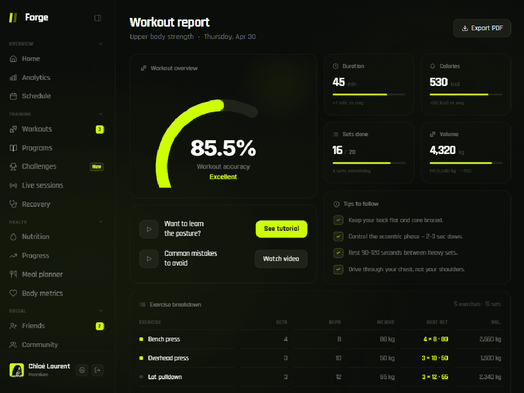
Post-workout, a detailed report surfaces the session's workout accuracy score — a composite measure of adherence to prescribed sets, reps, and rest intervals rendered as a radial gauge. This single number anchors self-assessment alongside traditional metrics like duration, volume, and calories burned. Contextual tips and tutorial links appear at the point of use, reducing the distance between identifying a weakness and addressing it.
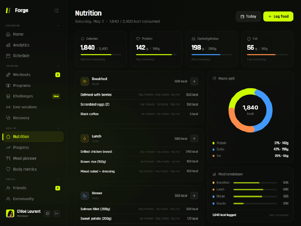
Nutrition tracking follows the same density principle. Four macro gauges — calories, protein, carbohydrates, fat — display remaining targets at the top. Below, meals are logged chronologically with per-item macro breakdowns. A donut chart and horizontal bar comparison complete the picture, turning nutrition from a retrospective review into an active decision-making tool.
Expectations vs. delivery
The original brief described a workout tracker with basic nutrition logging — a better version of the spreadsheet-and-app workflow the founder already used. What the project delivered was a full fitness operating system with real-time accuracy scoring, interconnected views spanning training and health, and a body-composition tracking module that was never part of the initial scope.
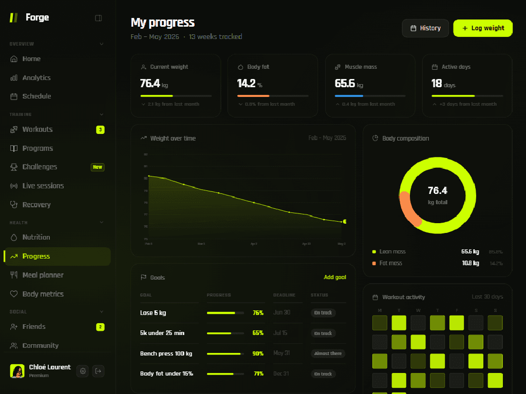
The progress view exemplifies this expansion. What began as a simple weight log evolved into a dedicated screen combining a longitudinal weight chart, body-composition donut, goal-progress table with deadline tracking, personal-records grid, and a 30-day workout heatmap — giving athletes the long-term perspective the brief hadn't anticipated they needed.
Tutorial integration within workout reports — surfacing form-correction videos at the point of use rather than in a separate learning section — emerged from research findings. Athletes abandon educational content when it requires context-switching; embedding it inside the report eliminated that friction entirely.
Results and impact
Engagement patterns shifted immediately after launch. Users who previously checked training data sporadically began opening the fitness training dashboard daily — drawn by the home view's ability to surface today's plan, yesterday's results, and weekly progress in a single scroll without requiring navigation.
The accuracy metric proved to be the highest-engagement feature. Athletes began treating their accuracy score with the same seriousness as a personal-record lift, driving measurable improvements in training consistency within the first month. The metric reframed workouts from a binary completed-or-skipped event into a quality gradient worth optimizing.
Nutritional adherence also improved materially. By placing macro targets directly above the meal log — and updating them in real time as food is recorded — the interface turned nutrition from a retrospective audit into an active decision-making tool. Users reported making better food choices in their final meal of the day because remaining targets were visible, specific, and actionable.